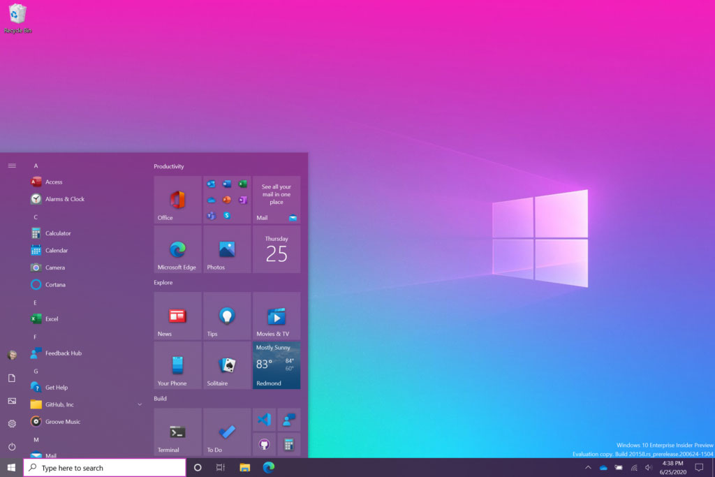
Say goodbye to the blocky Windows 10 Start Menu tiles with colored backgrounds and hello to partially transparent theme-aware tiles that look so much nicer.
Earlier this year, Microsoft revealed a sneak peek of the changes they were exploring with the Windows 10 Start Menu and the use of transparent tiles rather than ones with a solid background.
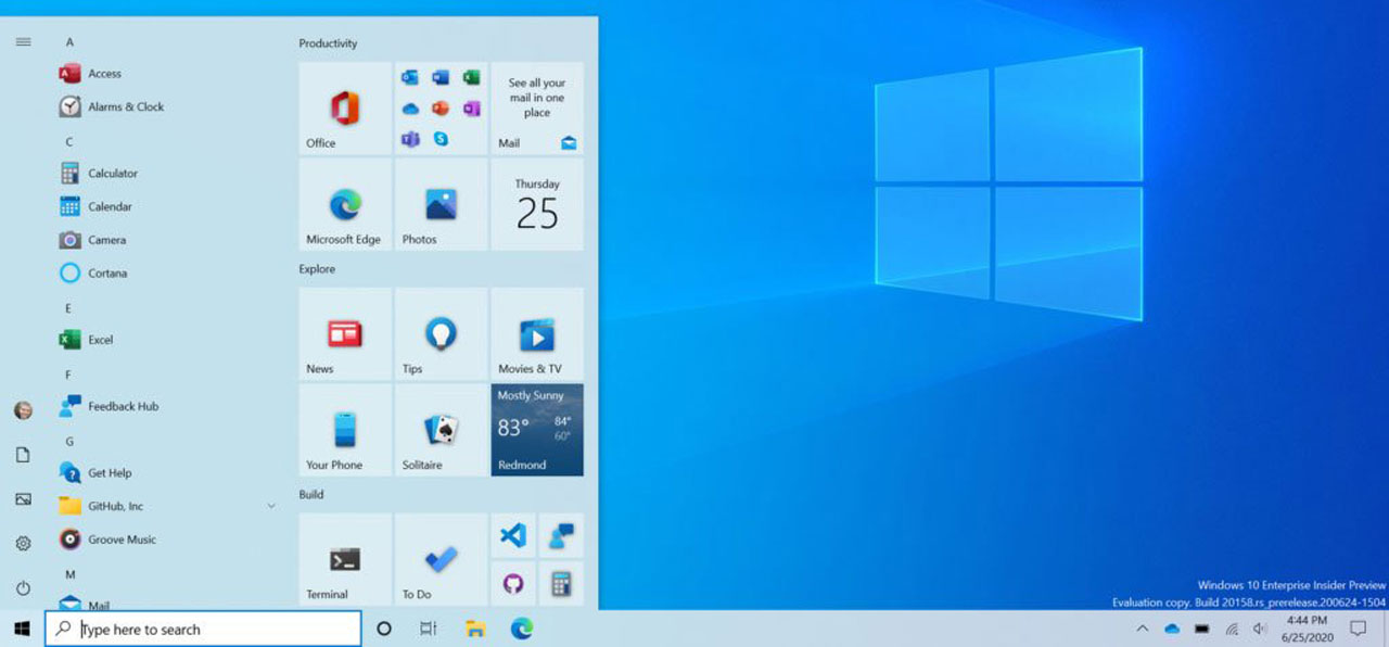
With today's Windows 10 Insider build 20161, Microsoft has finally unveiled the new Start Menu and its transparent tiles.
"We are freshening up the Start menu with a more streamlined design that removes the solid color backplates behind the logos in the apps list and applies a uniform, partially transparent background to the tiles. This design creates a beautiful stage for your apps, especially the Fluent Design icons for Office and Microsoft Edge, as well as the redesigned icons for built-in apps like Calculator, Mail, and Calendar that we started rolling out earlier this year."
Now, when you switch themes from Light to Dark, the partially transparent tiles will assume the Start Menu background color.
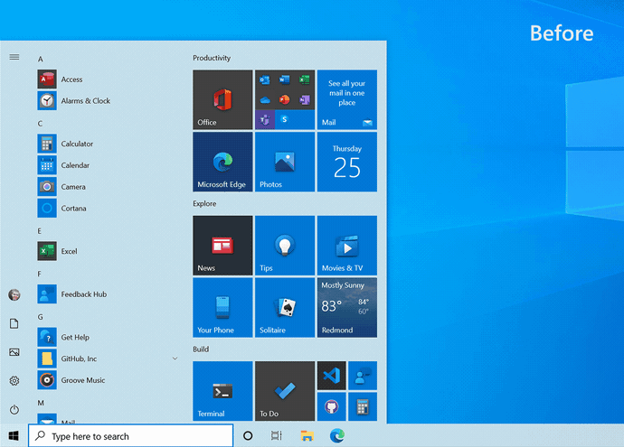
For example, below, you can see the new Start Menu with the Dark theme enabled.
When we switch to the Light theme, the Start Menu once again assumes the theme's background.
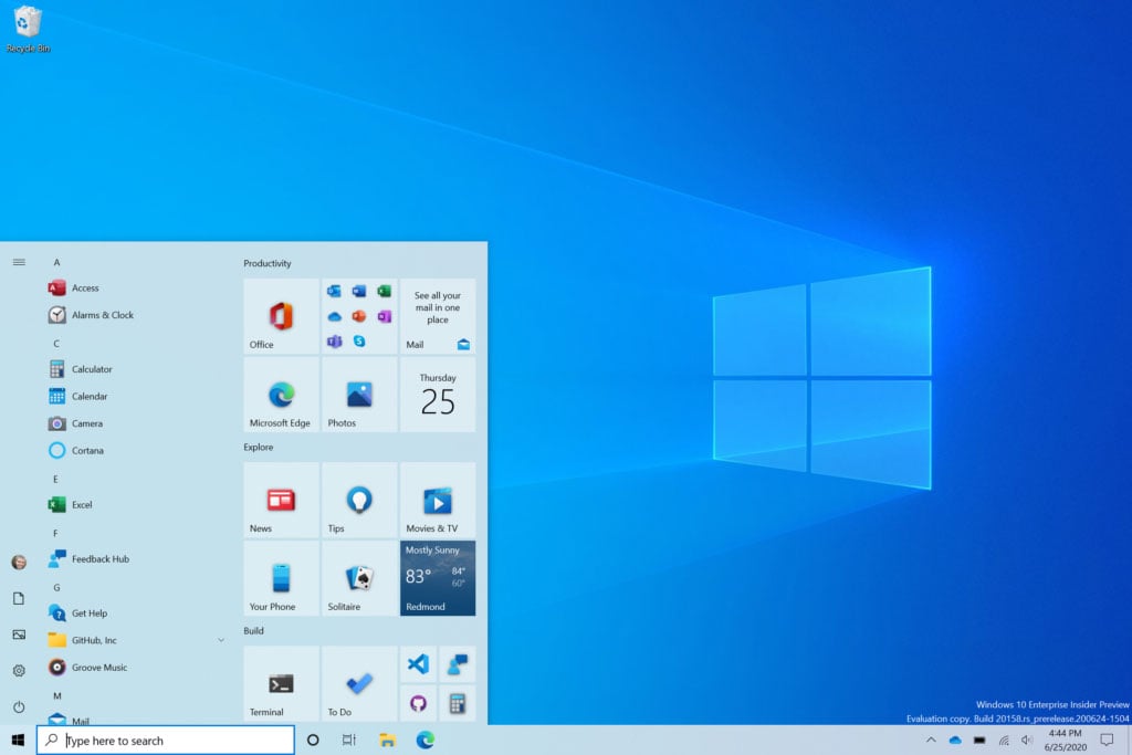
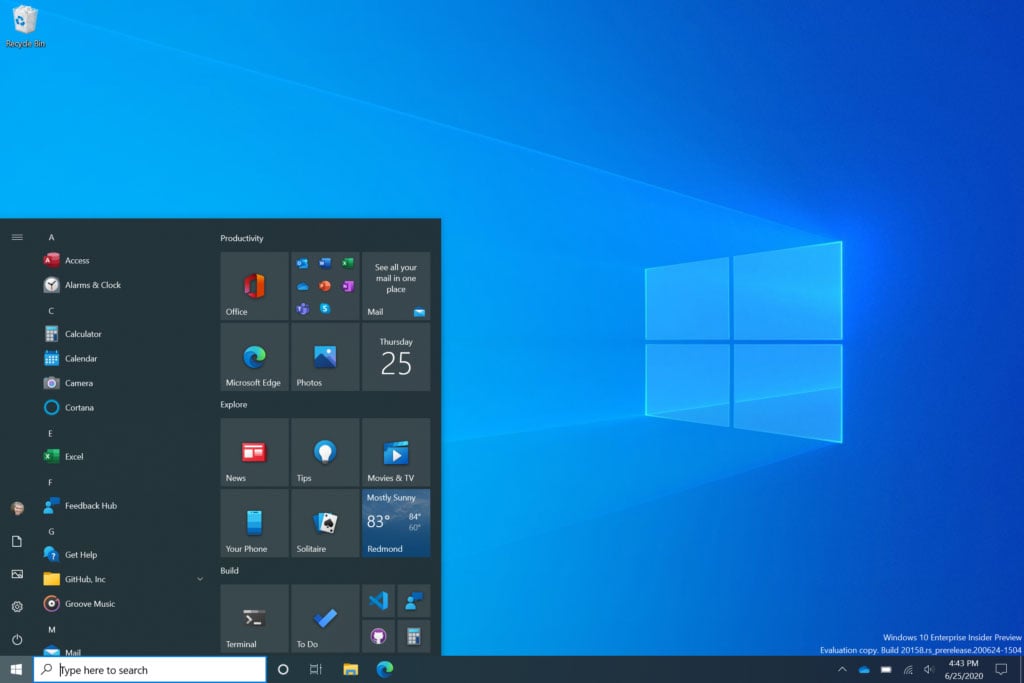
For those who are using custom themes, the new transparent tiles work well with them as well.
If you wish to see the color of a custom background on your Start Menu, you can enable an accent color, as explained below.
"First make sure to turn on Windows dark theme and then toggle “Show accent color on the following surfaces” for “Start, taskbar, and action center” under Settings > Personalization > Color to elegantly apply your accent color to the Start frame and tiles."
To try out the new Windows 10 Start Menu, you will need to be using the latest Windows 10 Insider build.
For everyone else, this new feature will be released to everyone in a future feature update next year.


Comments
DrkKnight - 3 years ago
MS Keeps insisting on cramming this start menu down our throats and so far there is nothing they have done to it that makes me want to use it, with each "improvement" being like putting lipstick on a pig. I don't need all the tiles and all the other crapolla they have added to it. When they go back to making it an actual start menu instead of an advertisement board I may actually start using it again. Until then I will stick with my NON advertisement third party start menu.
GT500 - 3 years ago
I rather enjoyed your comment.
I'll be sticking with my favorite Start menu replacement app as well. I'm not sure there's anything Microsoft could do to get me to stop using it, even if they implemented all of the features it has.
eLPuSHeR - 3 years ago
Good day.
Same here. "Classic" Classic Shell is still working under v2004 (19041.331).
fromFirefoxToVivaldi - 3 years ago
A very good change. App devs do not respect user choice and push icons with their own colours in .manifest files, often with white or other bright background, even if the user is using a dark theme (Opera is the main culprit, they even overwrite user changes during update).
Finally there won't be a need to manually change these values after each new application installation.
NoneRain - 3 years ago
Much better!