-
The new Chrome design. We get new tab shapes, a white tab background, rounded address bar, and more.
-
A single tab window has a white background, and with a white current tab, the tab and tab background blend together.
-
With multiple tabs open, the background changes to gray allowing for some tab separation. Still, background tabs only get a vertical separator, rather than distinct shapes.
-
Here's everything in incognito mode.
-
The new design takes up more space. The tab and address bar (shown here, maximized) is taller now.
-
The Chrome Sync UI now shows your photo right next to the address bar.
-
There are a few tweaks to the autocomplete pop-up, too.
Chrome is getting a major redesign soon, and this week new changes have started to land in Chrome's nightly "Canary" build. Google is launching a new version of Material Design across its products, called the "Google Material Theme," and, after debuting in Android P and Gmail.com, it's starting to roll out across Google's other major products. On Chrome, this means major changes to the tab and address bar. Remember, this is just a nightly build, so things could change before the stable release. But these changes line up well with previous Chrome redesign documents.
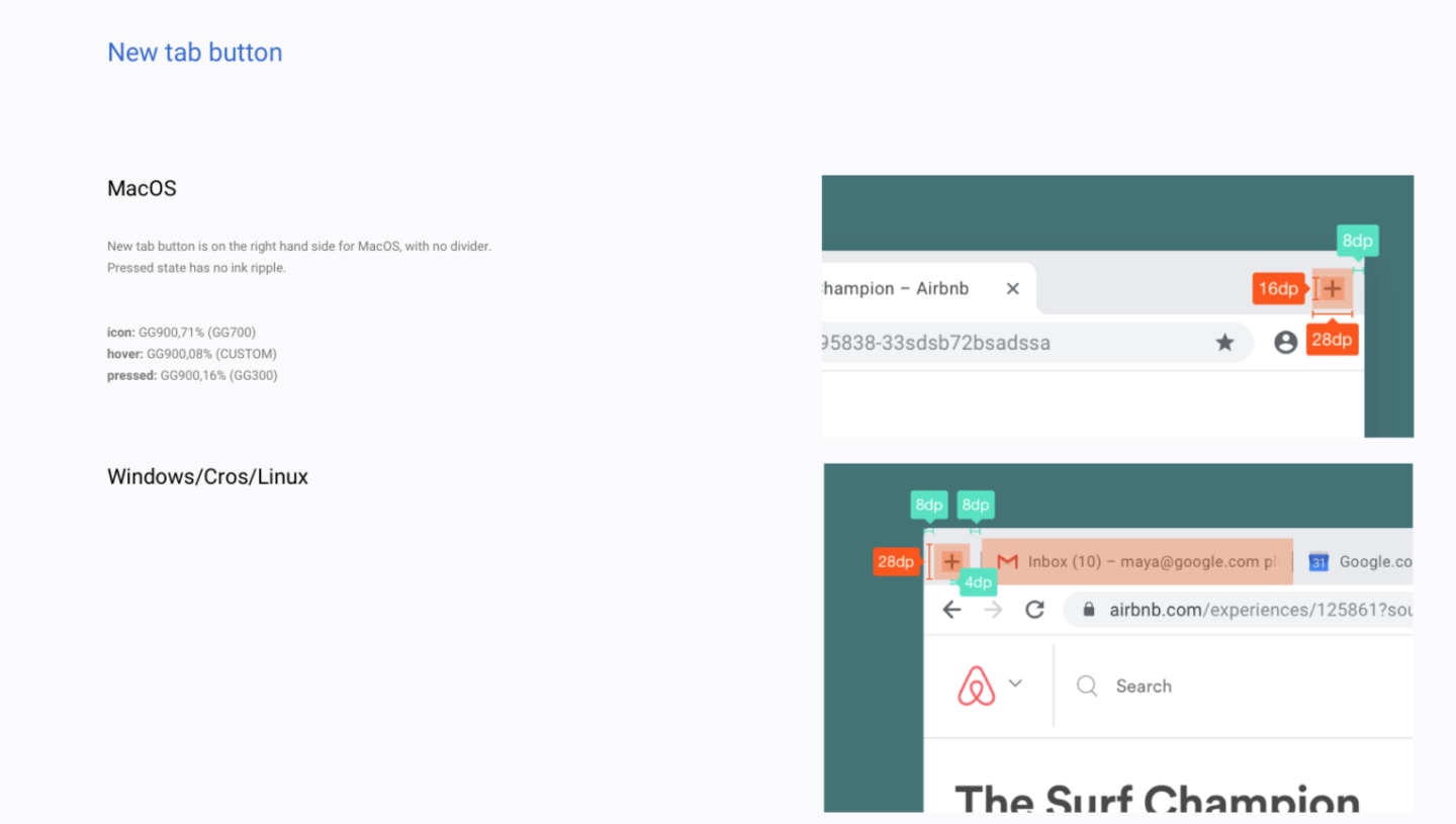
The first thing you'll notice is the tab bar. Tabs now have a rectangular shape with rounded corners instead of the trapezoidal shape of the current design. Tab separation has also undergone a lot of changes. With a single tab open, you won't see a distinct tab shape at all. The current tab is always white, and in single-tab mode, the background of the tab bar is white, too, so everything blends together. I like the general idea here: if you aren't using multiple tabs, there's no need to show all the tab-separation cruft.With multiple tabs open, the tab background switches to a light gray, and background tabs only get vertical separators rather than distinct tab shapes. Next to the tab bar is a big plus button for adding tabs, which is considerably more obvious than Chrome's current unlabeled button. I haven't gotten to try the Mac version (these are all Windows screenshots), but, according to the design docs, the new tab button will be on the left side for Macs eventually.
The address bar section gets some tweaking, too. The address bar is round now, just like on Android. The autocomplete drop down is now a box instead of a bar that spans the width of the window. To the left of the address bar is a new account button for Chrome Sync, which now shows your Google profile picture instead of the name of the account.
All the general New Material Design motifs are here: everything is white and round, and there's a bit more whitespace in things like the tab bar and autocomplete box. Again, everything is subject to change, but for now this is another step on the road to a stable design.
Listing image by Google Chrome
reader comments
321